
Why Accessibility Matters More Than Ever
Accessibility directly impacts:
- Patient trust (especially in healthcare)
- Legal compliance (ADA and WCAG 2.2+ expectations)
- Search engine performance
- Conversion rates and engagement
If a user can’t navigate your site, read your content, or complete a form, they won’t stay—and they won’t convert.
1. Start with Semantic Structure
Accessibility begins before design—with clean, meaningful HTML.
Best practices:
- Use proper heading hierarchy (
H1 → H2 → H3) - Use semantic elements (
<nav>,<main>,<section>,<button>) - Avoid using
<div>s for everything
Why it matters:
Screen readers rely on structure to interpret content. A well-structured page allows users to navigate quickly and confidently.
2. Design for Color Contrast (Not Just Brand Colors)
One of the most common accessibility failures is poor contrast.
Guidelines:
- Meet WCAG contrast ratios:
- 4.5:1 for body text
- 3:1 for large text
- Never rely on color alone to convey meaning
Quick fix:
If your brand color is too light, use it as an accent—not for body text or buttons.
3. Make Navigation Simple and Predictable
Users should never have to “figure out” how your site works.
Key elements:
- Clear, consistent navigation
- Descriptive link text (avoid “Click here”)
- Logical page flow
Accessibility tip:
Include a “Skip to Content” link for keyboard users.
4. Ensure Full Keyboard Accessibility
Not everyone uses a mouse.
Your site should allow users to:
- Tab through all interactive elements
- Clearly see focus states (outline or highlight)
- Use drop-downs, modals, and forms via keyboard
Common mistake:
Removing focus outlines for design reasons—this breaks accessibility instantly.
5. Use Accessible Forms (This Is Where Most Sites Fail)
Forms are critical—especially in healthcare.
Best practices:
- Every input must have a label
- Use clear error messages (not just red borders)
- Group related fields with
<fieldset>and<legend> - Provide helpful instructions
6. Write for Readability (Not Just SEO)
Accessible content is easy to read, scan, and understand.
Tips:
- Use short paragraphs
- Break content with headings and bullet points
- Avoid jargon when possible
- Aim for a 6th–8th grade reading level (especially in healthcare)
7. Add Meaningful Alt Text to Images
Alt text isn’t for SEO—it’s for users.
Good alt text:
- Describes the purpose of the image
- Avoids phrases like “image of”
- Is concise but informative
8. Make Multimedia Accessible
Video and audio content must be usable by everyone.
Requirements:
- Captions for videos
- Transcripts for audio
- Avoid auto-play (or provide controls)
9. Design for Cognitive Accessibility
Accessibility isn’t just visual or physical.
Consider:
- Clear instructions
- Consistent layouts
- Minimal distractions
- Avoiding overwhelming users with too much information at once
10. Test, Test, Test
You can’t guess accessibility—you have to test it.
A Sample of Our Favorite Tools to Use:
- Level Access
- WebAIM
- Lighthouse (built into Chrome)
- WAVE
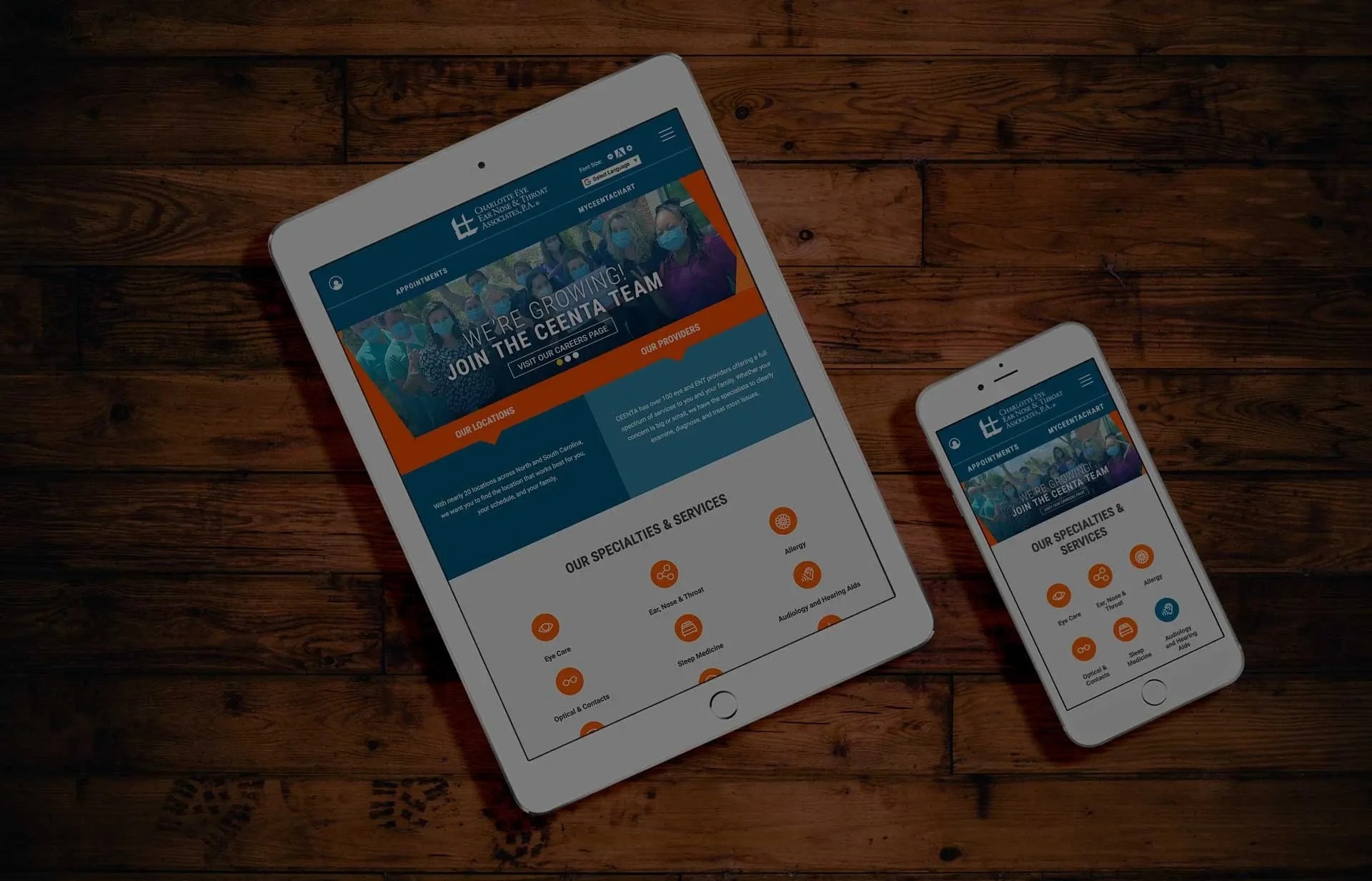
Accessibility in Healthcare: A Higher Standard
For healthcare organizations, accessibility directly affects patient care.
Users may be:
- Older adults with vision challenges
- Patients with cognitive impairments
- Individuals using assistive technology
An accessible site ensures:
- Patients can find providers
- Schedule appointments
- Understand conditions and treatments
- Trust your organization
Final Thoughts: Accessibility Is Good Design
Accessibility isn’t a limitation—it’s a design advantage.
The best websites in 2026:
- Are cleaner
- Are easier to use
- Convert better
- Reach more people
And most importantly—they don’t exclude anyone.
Quick Accessibility Checklist
- Proper heading structure
- Strong color contrast
- Keyboard-friendly navigation
- Accessible forms
- Clear, readable content
- Alt text on images
- Captions on videos
- Tested with real tools
« Back to Blog
- AI in Healthcare Websites: How Remedy CMS Is Helping Organizations Work Smarter
- HHS Extends WCAG Accessibility Deadline for Healthcare Providers: What Practices Need to Know
- Why Patient Experience Starts With Your Website—and How Remedy CMS Gets It Right
- Healthcare Digital Trends in 2026: A Designer’s Perspective
- Healthcare Digital Trends in 2026: A Developer’s Perspective
Ready to Transform Your Practice's Digital Experience? Contact Us Today to Schedule a Demo.
Trusted By


© 2026. All rights reserved. E-dreamz, Inc.